
GLo Microsite
PROJECT OVERVIEW
In 2018, Best Western, an award-winning and global hospitality company, strived to further innovate and diversify their brand portfolio with the addition of four new boutique brands. They struggled with their brand perception as many leisure and business travelers still held the belief that Best Western’s properties were largely only for truckers and blue collar workers.
I undertook the expeditious and arduous task of simultaneously designing unique microsites for all four brands to appeal to existing and prospective hotel owners who were in demand of a hotel refresh. In this case study, I focus on the GLo microsite.
Project completed as a full-time employee at Ideas Collide. To comply with the non-disclosure agreement, confidential information has been omitted from this case study. Portfolio display permission can be revoked at any time if the agency or client deems necessary.
YEAR
2019-2020
ROLE
Design Lead
METHOD
UI, UX, Web Design, Accessibility, Prototyping, QA
TOOLS
Adobe XD, Illustrator, Photoshop, ADA tools
DELIVERABLE
4 Boutique Hotel Microsites
Transforming Hotel Developer Portfolios
CHALLENGE
Adapting to a Generational Shift
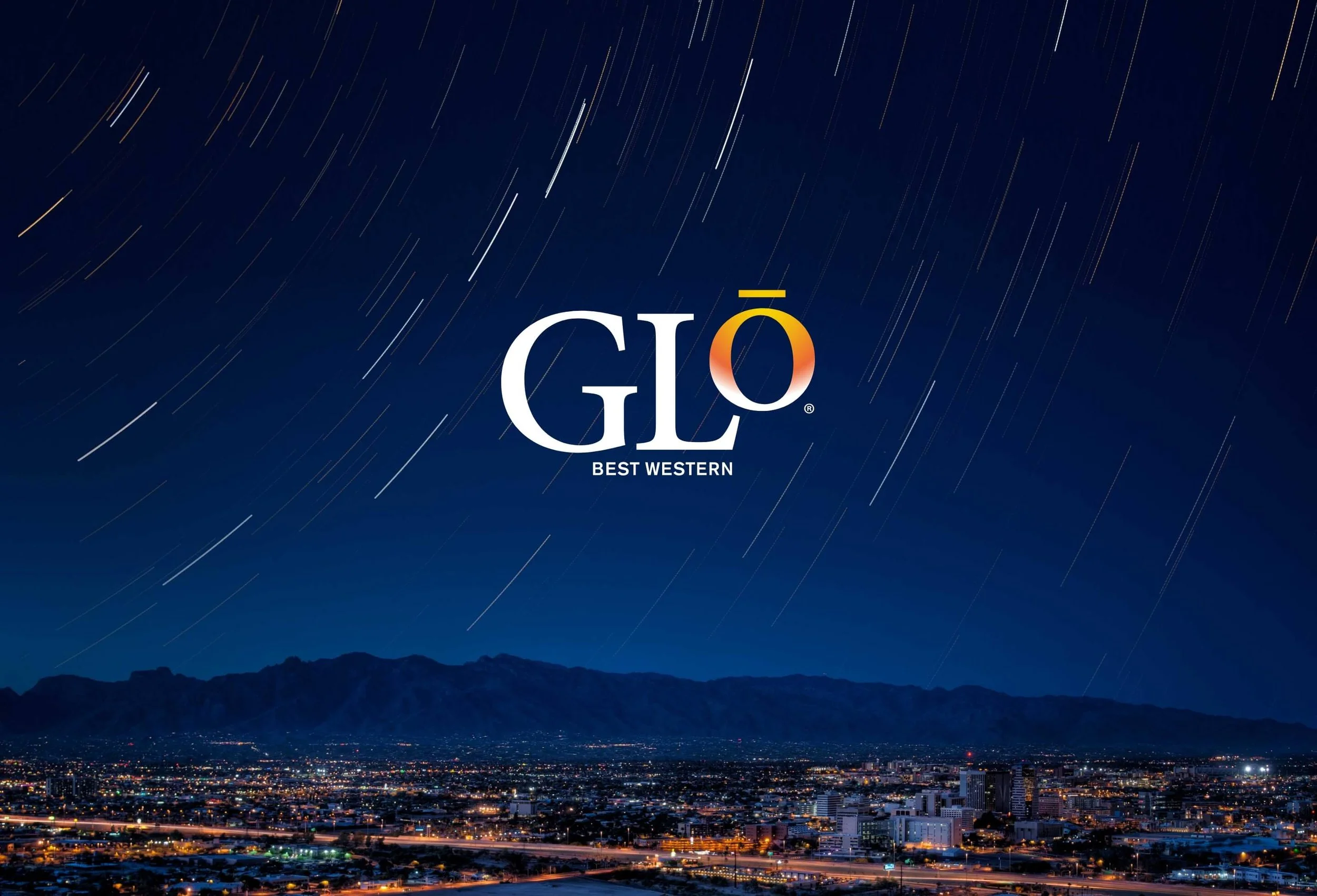
Best Western's objective was to establish distinct brand identities, creating clear differentiation from their parent brand. GLo, in particular, targeted a millennial and modern audience, specifically catering to tech-centric travelers seeking elevated experiences in suburban settings. In response to a dynamic shift within the hotel owner community, characterized by younger developers inclined towards risk-taking and lifestyle-oriented projects, Best Western needed to adapt swiftly to align with these evolving preferences. The challenge lay in not only appealing to a new customer base but also accommodating the changing demographic and mindset of hotel owners within the community.

Brand Voice
GLo is a boutique hotel delivering a well-traveled lifestyle with bold options to work, play, and live healthier on the road.

User Insights
Target Audience
New and seasoned entrepreneurs
Hotel developers who own more dated BW hotel concepts
Motivators
Need for accommodations in a new or niche market
Further diversification of properties
Multi-use developments to serve both travelers and surrounding community
Transforming hotels into appreciating assets

User Needs
Use microsites as a long-term B2B sales tool for hotel development
Convert existing hotels or create new builds to increase revenue
Find resources to further understand boutique brand opportunities
Business Needs
Highlight the unique attributes of the new boutique brand to encourage developers to build
Help developers become more competitive in an already saturated market
Increase revenue, brand loyalty members, and further establish the parent brand as a global partner to developers
PROCESS
Capturing the Brand Essence
In the race to launch four microsites, as the sole designer, I prioritized efficiency at every phase of this project. My approach began with an in-depth competitor analysis, examining websites from similar parent brands and mid-scale to boutique sub-brands. This exploration encompassed aesthetics, alignment with or departure from parent brands, unique functionality, and content flow.
Collaborating with the content director, we crafted a cohesive wireframe for the microsites, ensuring a consistent flow that seamlessly accommodated copywriting. Using this wireframe and insights from the competitor analysis as a foundation, I concentrated on enhancing the microsites' brand elements. This involved varying animation, scrolling direction, iconography, photography, and navigation.
From visual design to prototyping interactions, creating a comprehensive style guide for development, and conducting rigorous QA rounds, I ensured polished and user-friendly experiences for a successful launch.
Competitor Analysis Insights
Lacked distinction between parent and sub-brand websites
Heavy reliance on printed materials housed on websites to communicate major selling points
Inconsistent or non-existent website responsiveness
Limited unique enhancements like video or animation


Discovery
Competitor analysis
Determine ADA Compliance goals
Wireframe
Design
4 Microsite Designs
Prototyping of interactions & transitions
Style Guides for dev handoff
Iterate, Refine, Launch
Refine pages based on dev and client feedback
QA developed microsites
Style Guide
Style guide detailed grid systems, graphics, fonts, color palettes, form states, button states, etc. for cohesiveness between design and development.
SOLUTION
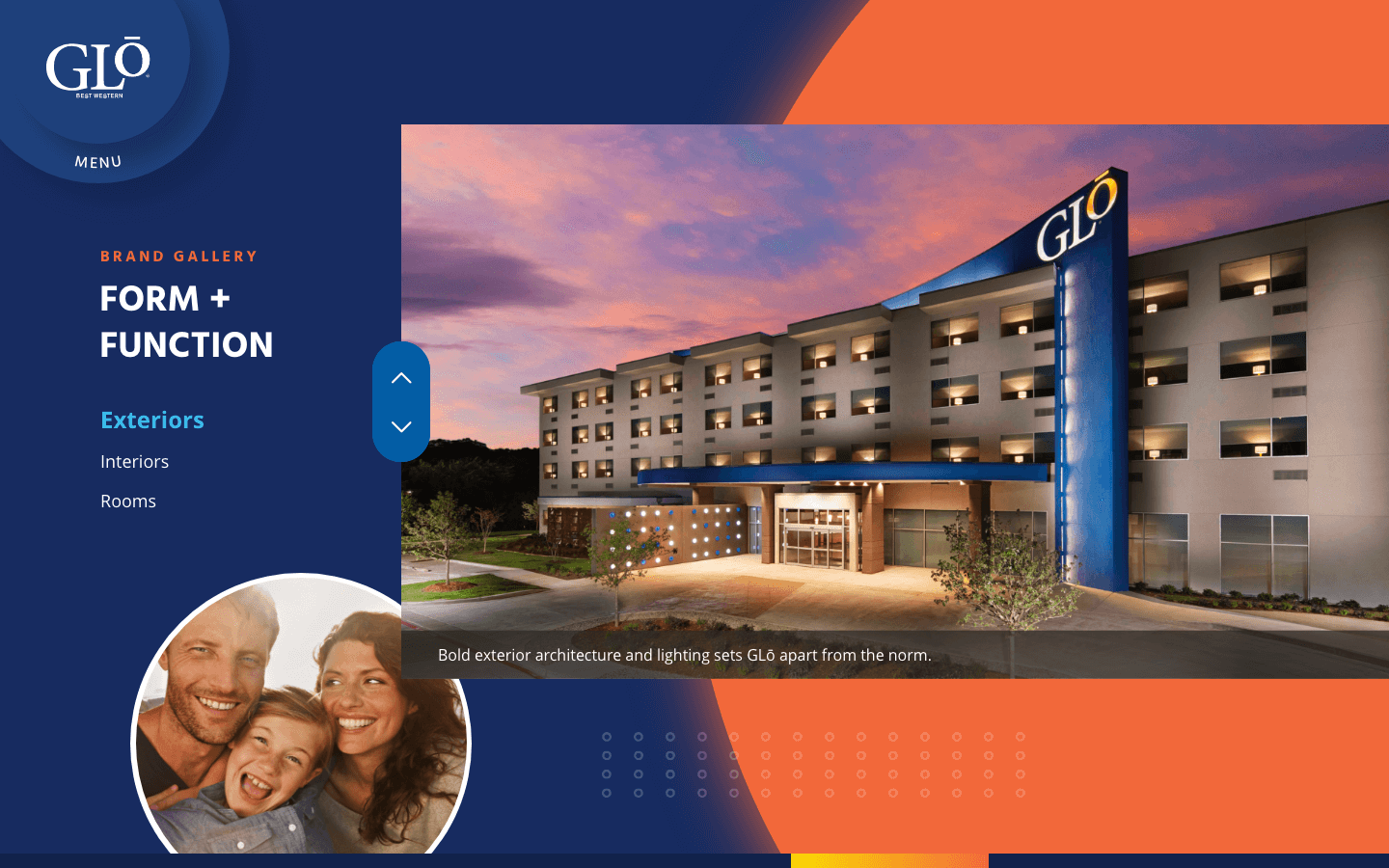
Features
Emphasized blues and blue gradients from the brand’s colors, and incorporated bold, floating circles throughout along with warm and bright lifestyle imagery to serve as subtle pops of color.
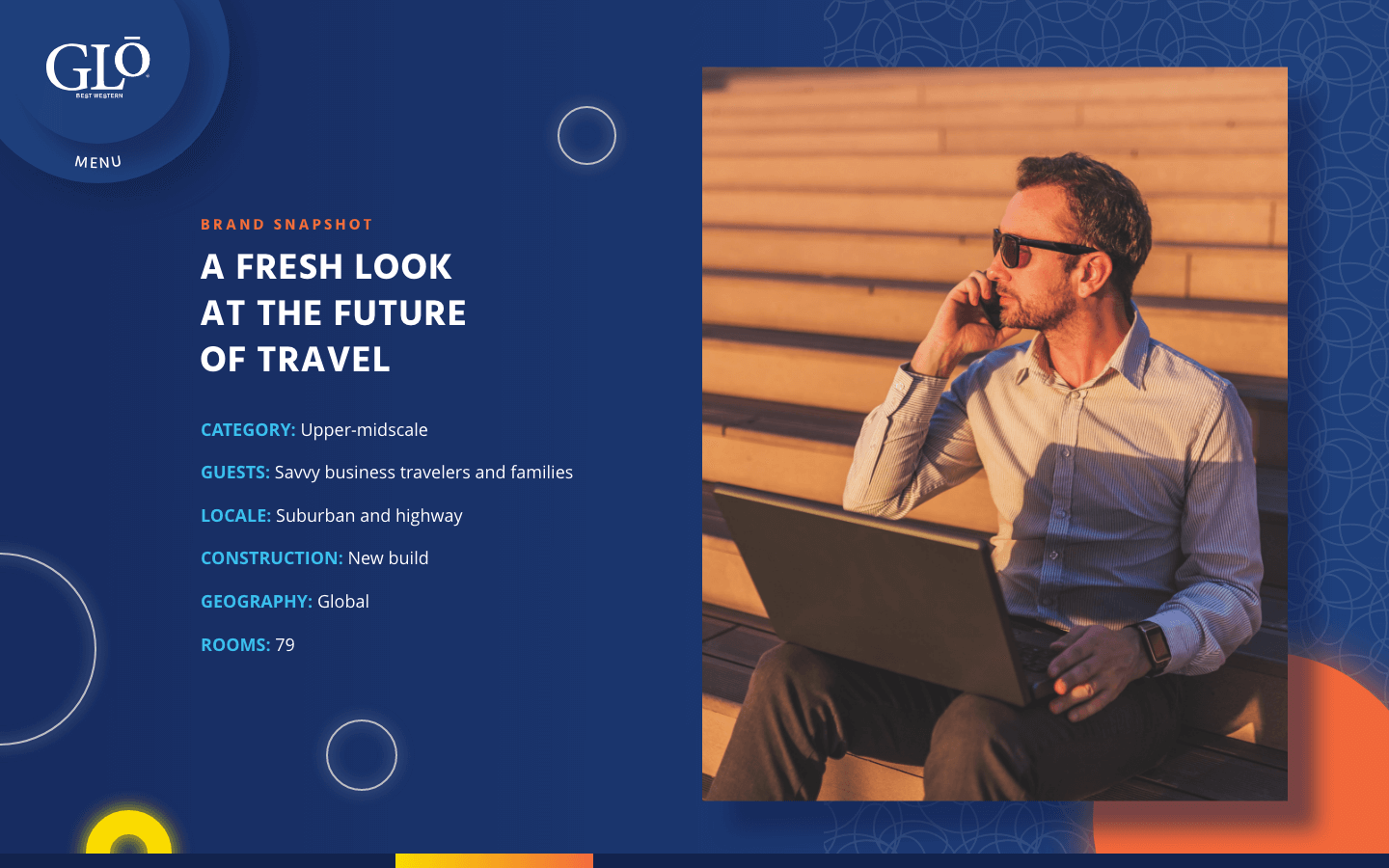

To further distinguish from competitor sites, I implemented horizontal scrolling where a glowing "O" travels from left to right, guiding the user throughout the web experience. A glowing progress bar also helps to ground users.
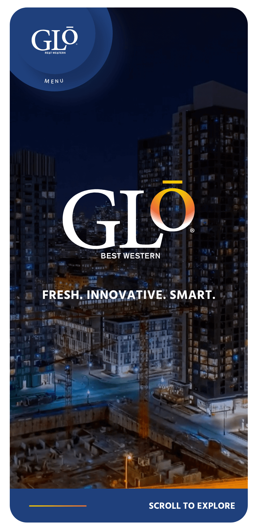

Used font sizes and color contrast pairings that are accessible for a broader range of users, and aimed to achieve a WCAG 2.1 AA level of ADA compliance across all devices.

Implemented a distinct menu navigation that is condensed into a circle, mimicking the “O” in the logo, instead of a more common horizontal navigation bar.
IMPACT
Achievements
The new hotel developer microsite launched in October 2020. I found unique ways on how to visualize the end result within Adobe XD and where to add value through design to further impact the user. Adding progress bars and directional cues with unobvious elements helped to reduce the cognitive load for the user. Through prototyping in XD, I was also able to paint a full picture of the final designs to both the client and web developer prior to web development.
Established notable selling tools for B2B hotel development
Designed fully responsive microsites
Aligned all microsites to an AA level of ADA compliance