
Kolbe Website
PROJECT OVERVIEW
Kolbe is a seasoned business management consultancy that specializes in helping clients channel their instinctive strengths. Kolbe wanted to boost their website traffic by refreshing their online presence after 40+ years in the industry. My task was to swiftly develop a modular website on a CMS platform for a custom front-end and back-end experience. Adapting to evolving technology and accommodating dense content, I aimed to align the site with Kolbe's human-centered service offerings, bridging the gap from the original 1997 launch.
Project completed as a full-time employee at Ideas Collide. To comply with the non-disclosure agreement, confidential information has been omitted from this case study. Portfolio display permission can be revoked at any time if the agency or client deems necessary.
YEAR
2019
ROLE
Creative Director, Design Lead
METHOD
UI, UX, Modular Web Design, Accessibility, Information Architecture, Prototyping, QA
TOOLS
Adobe XD, Illustrator, Photoshop, ADA tools
DELIVERABLE
Website Redesign
More Than a Personality Quiz
CHALLENGE
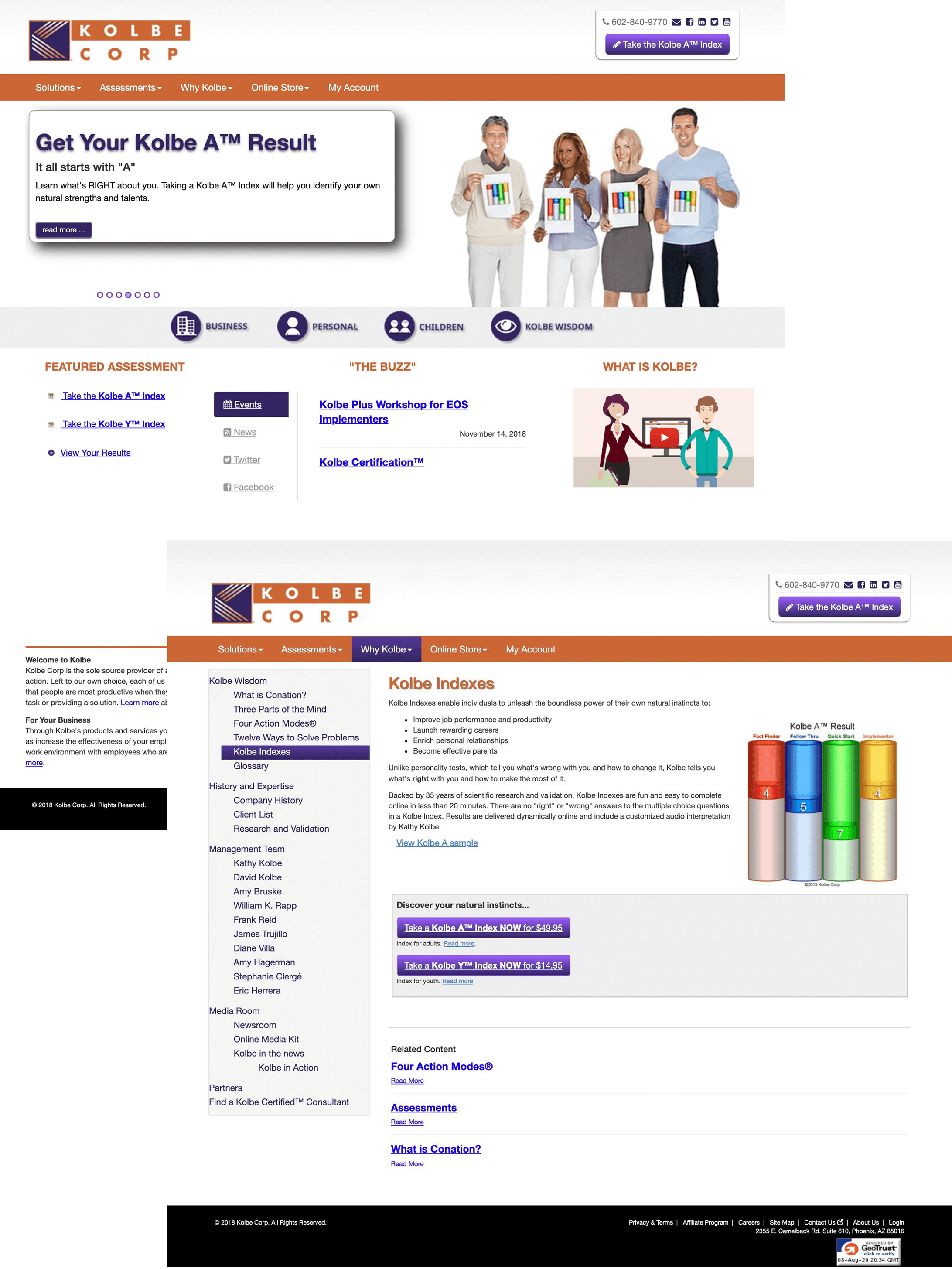
Streamline + Modernize
The mission for the revamped website was clear: elevate the design and boost conversion rates. This platform caters to a diverse audience—from HR professionals and independent consultants to entrepreneurs, parents, and couples— all looking to complete a Kolbe assessment that informs their personal, professional, and relational goals. It's not just a website; it's a dynamic hub where user experience meets personal and professional growth.
User Needs
Complete one or multiple assessments dependent on goals
Find an ideal career
Hire best-suited talent
Foster interpersonal connections
Become a consultant
Attend seminars and events
Business Needs
Highlight the unique aspects of the five assessments (indexes) and emphasize their differences from personality tests
Increase visibility for additional applications and services to enhance user engagement
Craft a digital brand identity that appeals to both the 80% B2B and 20% B2C user base
Optimize and streamline user flows and journeys
Responsive, reliable, and ADA compliant website redesign
PROCESS
My Role
Teaming up with skilled web developers, project managers, and a creative copywriter, I contributed to reshaping Kolbe's digital landscape. The project kicked off with an in-depth discovery phase after two assessment seminars led by Kolbe, during which our team completed both consumer (A index) and business (B index) assessments to truly understand their needs. Guided by these insights, I led the design of a captivating homepage and a versatile design system. After gaining client approval, designs were integrated into annotated module libraries, complete with videos of functionalities and interactions, before handoff to our development team. Over a series of 10 sprints, we iteratively refined and enhanced these modules resulting in the successful launch of the revamped Kolbe website.
Discovery
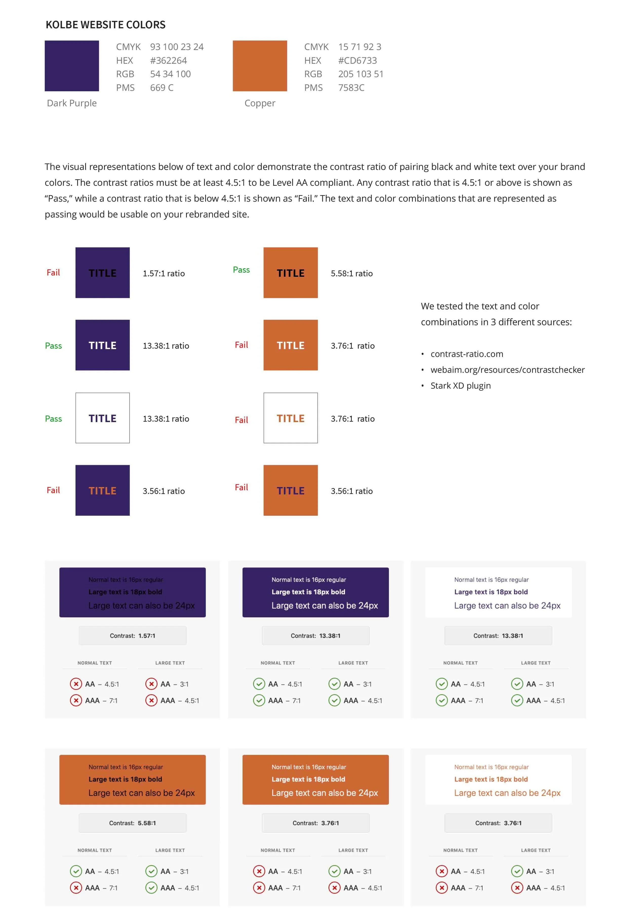
Brand Colors + Font Audit
Sitemap
Determining ADA Compliance goals
Design
Homepage Designs
Design System
Design for 10 remaining sprints and create corresponding module libraries for dev handoff
Iterate, Refine, Launch
Refine pages based on dev and client feedback
QA developed modules on front end
Further Discovery
In collaboration with the copywriter, I created the sitemap, strategically eliminating duplicate content, bulky sidebars, and redundant tertiary pages. As we concluded the discovery phase, I took pivotal steps to ready the client's brand elements for the web:
Selected the Source Sans Pro typeface for its versatile font styles, condensed letterforms ideal for dense text, and seamless pairing with Futura, the font gracing Kolbe's logo
Conducted color contrast tests of the main brand colors to create a digital color palette for both the brand logos and future UI elements
Curated a diverse collection of stock photography examples, applying various effects to capture the client's preferences and identify a visual style that resonates universally with users
DESIGN
Homepage Hero
At the heart of Kolbe's vision stood the homepage hero module, demanding a visually captivating and interactive gateway to their five core assessments upon website entry. Crafting numerous mid- to high-fidelity wireframes became an art, delicately balancing the client's desire for innovation with the need for user-friendly simplicity. It was a tightrope act—simplistic designs risked an impression of lacking innovation, while excessive complexity threatened user abandonment.
Homepage Wireframes
These wireframes aimed to guide Kolbe’s users to quickly decide which of the five assessments best aligned with their goals.
Hero Concept 1
The prominent Kolbe "K" stands as the focal point and radiates the essence of the five key user groups. This concept artfully incorporates subtle scientific elements harking on identity and expression.
Hero Concept 2
This concept calls attention to Kolbe’s brand focus, the “conative mind,” the part of the mind that drives how you get things done. The lighter color palette, soft gradients, and rounded elements communicate a friendly mood.
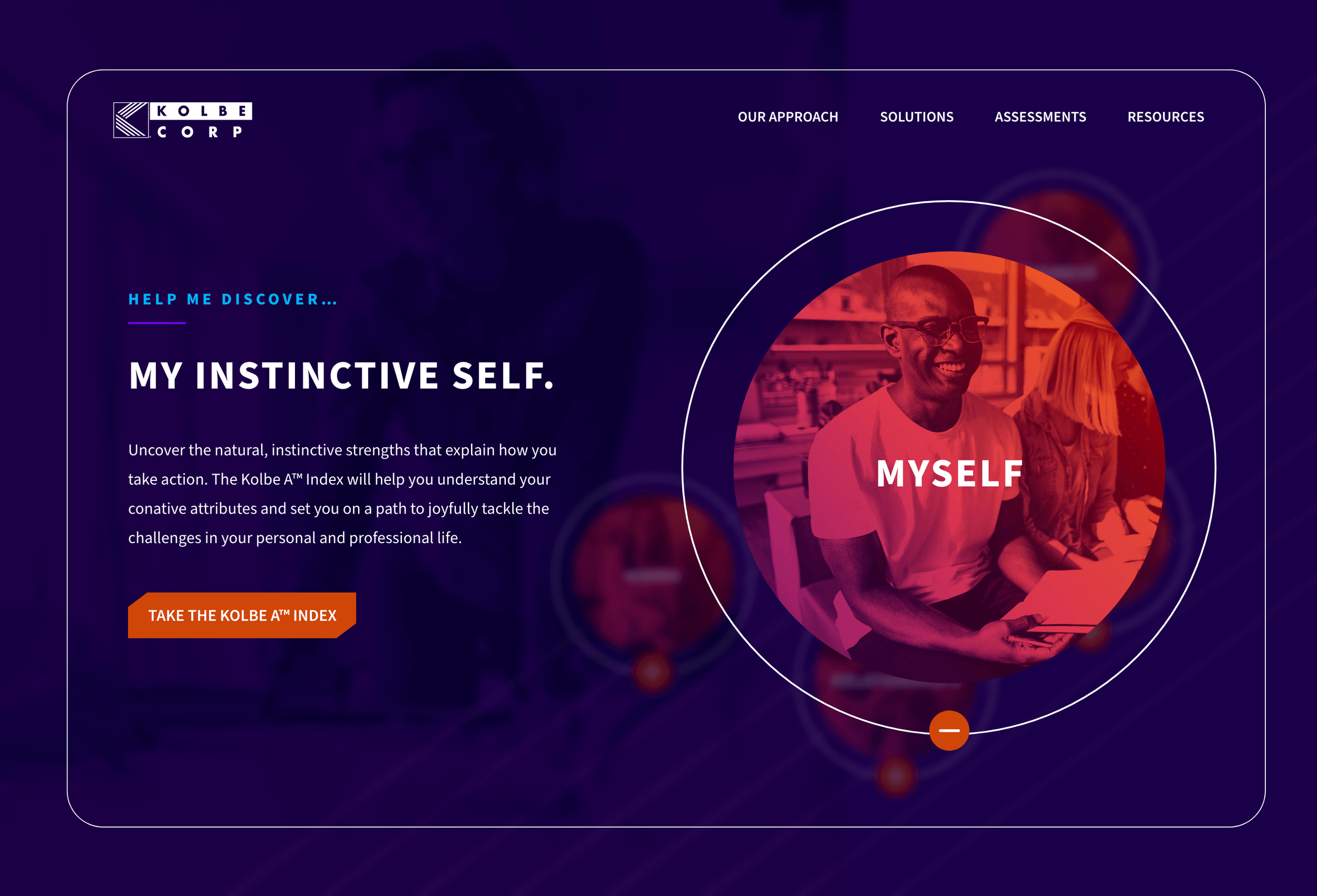
Final Homepage Hero
Clicking the "Help Me Discover" button empowers users to uncover the assessment and journey that aligns perfectly with their needs. Infusing the polished Kolbe brand colors into lush gradients infuses the hero section with a lively and dynamic ambiance. The combination of diverse user photography set in various environments, coupled with smooth animations, ensures an engaging and fluid user experience.
SOLUTION
Design System
Crafting the hero module and subsequently shaping the homepage played a pivotal role in solidifying the brand's fresh web identity, honing both new and existing content, and defining a clear visual hierarchy and functionality. These designs also played a key role in streamlining the development of the comprehensive design system.
Module Libraries
In the website redesign, the new modules and page mockups introduced a more defined page and section hierarchy. Purposeful incorporation of negative space was employed to highlight key visuals and content, contributing to a cohesive digital brand identity. Moreover, meticulous efforts were made to ensure compliance with WCAG 2.1 AA standards, enhancing accessibility and user-friendliness.
IMPACT
Achievements
Redesigning this website marked my first venture into modular design, a challenging yet rewarding endeavor within a tight timeline. Despite an optimized mobile experience, the homepage hero module presented some issues, leading to valuable insights gained through collaborative discussions with the development team. This deepened understanding significantly streamlined page creation in the ACF on the backend. Reflecting on the process, I recognize the need for a broader understanding of accessibility, motivating me to expand my knowledge in this area moving forward.